
Pantone has been the leader in selecting and promoting the “Color of the Year” since the year 2000 but now other companies, especially paint companies are getting involved as well. The interesting observation is, they are not all on the same page for 2017, or maybe they are, you be the judge.
The Color of the Year, which is announced in the fall of the previous year, reflects the current cultural climate and starter trends being observed. It influences the trends in the year of its namesake and affects all facets of design including fashion, interior design, industrial design, architecture, etc.
Pantone’s color for 2017, Greenery signifies beginnings: a fresh New Year; healthier food resolutions and growing vegetarian trends; grass and the outdoors during spring and summer. But most prominently, the yellow-green hue (Pantone 15-0343) comments on the concept of “environment.” Most obviously, “environment” today refers to the “go-green” movement—which, while not a revolutionary idea in 2017, has reached a crescendo this year. “There’s a growing desire to reconnect with Nature and what is real, and find ways to disconnect from technology. We need a break. We need to stop and breathe,” Laurie Pressman, the Pantone Color Institute’s vice president, told to FORBES. “(Greenery) is about unity and community—connecting to oneself and others and a higher purpose, Nature.”
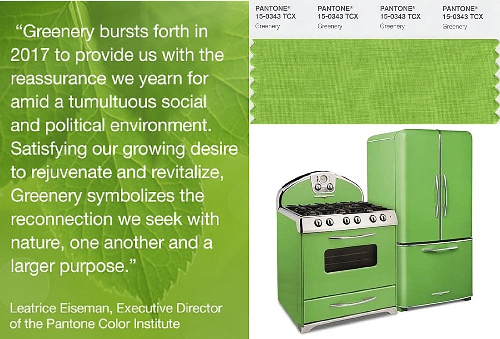 Photo: Pantone
But beyond just the natural environment, the color reflects the divided social and political landscape. Contrary to what many have reported, the selection of Greenery wasn’t directly influenced by the green of money or the recent election. “Nature is free, and the color isn’t meant to be partisan,” Pressman said.
Greenery is not a “green with envy” hue, unlike 2013’s color of the year, Emerald, which symbolized luxury. Greenery taps into the opposite: minimalism. Pressman referred to a motto by fashion designer Vivienne Westwood that partly inspired Pantone to choose Greenery: “Buy less, choose well, make it last”—a concept that also influenced one of Westwood’s collections. Pressman additionally cited how companies such as H&M have started environmentally-friendly lines, often made with recycled materials.
As a stark contrast, Benjamin Moore a leader in really great paint colors, has selected a dark moody color as their Color of the Year for 2017. Benjamin Moore’s Color of the Year, Shadow 2117-30, is allusive and enigmatic — a master of ambiance. “After a year of looking at white, we were looking for something with more feeling,” a spokesperson for the company said. The company also shared a palette of 22 colors they recommend pairing with this statement hue, which includes other jewel tones like ruby and emerald.
“It ebbs and flows with its surroundings, and light brings it to life. Rich, royal amethyst can fade into the soft lilac-grey of distant mountains or morph into lustrous coal. Indulge your mysterious side. Let Shadow set the mood.” – Ellen O’Neill, Creative Director, Benjamin Moore Paints
“Emotional connections with this color evoke nostalgic memories of light on space and color.” – Carl Minchew, Vice President of Color and Design, Benjamin Moore Paints
It seems that Sherwin-Williams and Benjamin Moore are closer in their thinking having chosen less vibrant more somber, moody, earthy tones that offer a respite and an environment for reflection and safe-haven from a world full of stimulation and information overload. They are the antithesis of vibrant green. Perhaps a reflection of the current political climate.
Sherwin-Williams doesn’t usually select just one color for the year, but for 2017 they did and it is Poised Taupe SW 6039. They feel it creates a cozy lifestyle and brings a sense of sanctuary into the home. It diffuses the stresses of the world outside our doors — so much so that they felt it restored balance when one walked across the threshold.
The Danes have a word to describe this feeling, hygge (pronounced hue-gah), which loosely translates as cozy, or creating a sense of coziness and warmth. The soft glow of candle-light, a toasty drink, and the company of family and friends is certainly hygge, but this feeling comes from creating the right atmosphere.
There is a particular beauty to be admired in homes that are allowed to age gracefully and show the wear and tear of everyday life. Lived-in homes seem to evolve harmoniously with their inhabitants. Every scratch, crack and mark records a story, a memory. The patina of a weathered wood tabletop can reveal the life and laughter of a party or the stain of spilled milk. At a time when perfection can seem like the ideal, a space that celebrates a well-lived life can be a sanctuary.
The Sherwin-Williams story of taupe is simple. Earthen brown combines with conservative grey and the result is a weathered, woodsy and complex neutral that celebrates the imperfections and authenticity of a well-lived life.
So whether you are going outdoors with Greenery, Shadow or Poised Taupe these are some of the top colors you will probably be seeing in 2017. We could see ourselves using them all but not all in all rooms. Here is how we would use them.
Greenery
Great for kids spaces, breakfast rooms, bright spaces
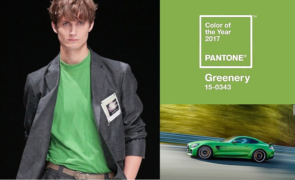 Photo: Pantone
Shadow
Great for home theaters, bars, family rooms, dark spaces, man caves, powder rooms
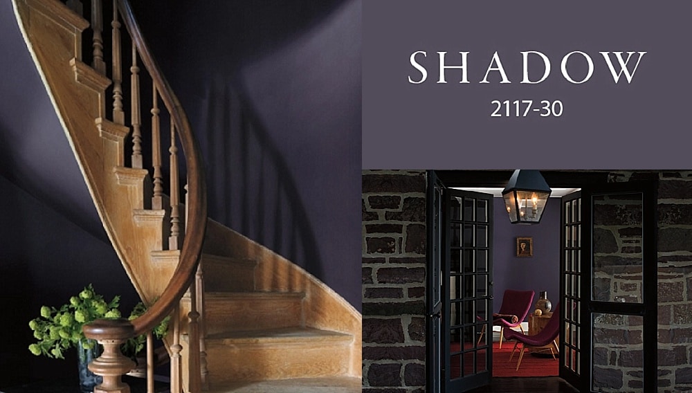 Photo: Benjamin Moore
Poised Taupe
Great for living rooms, dining rooms, foyers, master bedrooms
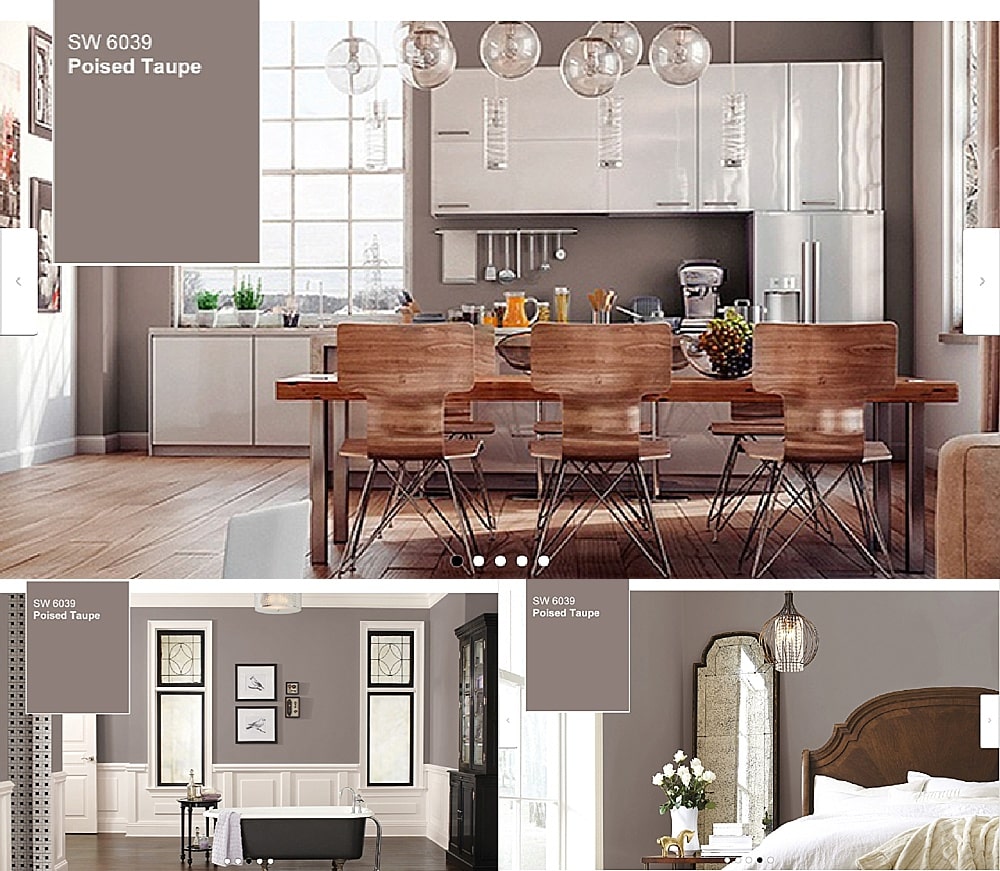 Photo: Sherwin-Williams