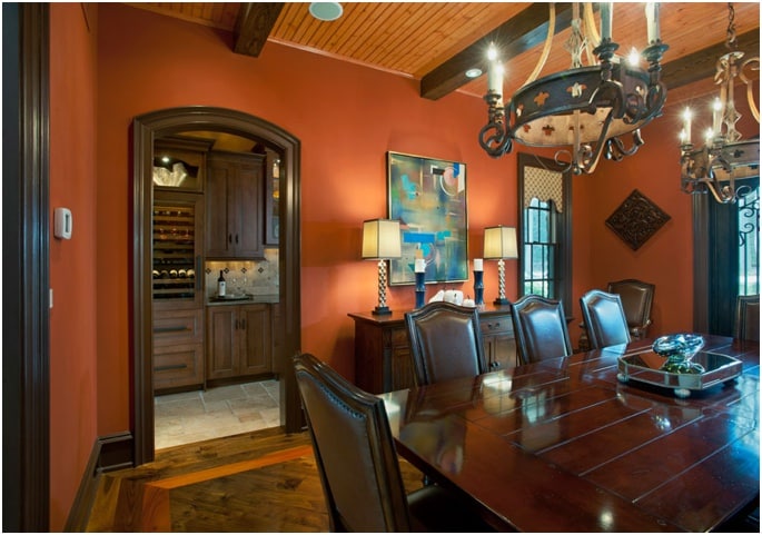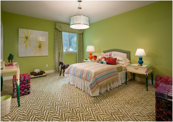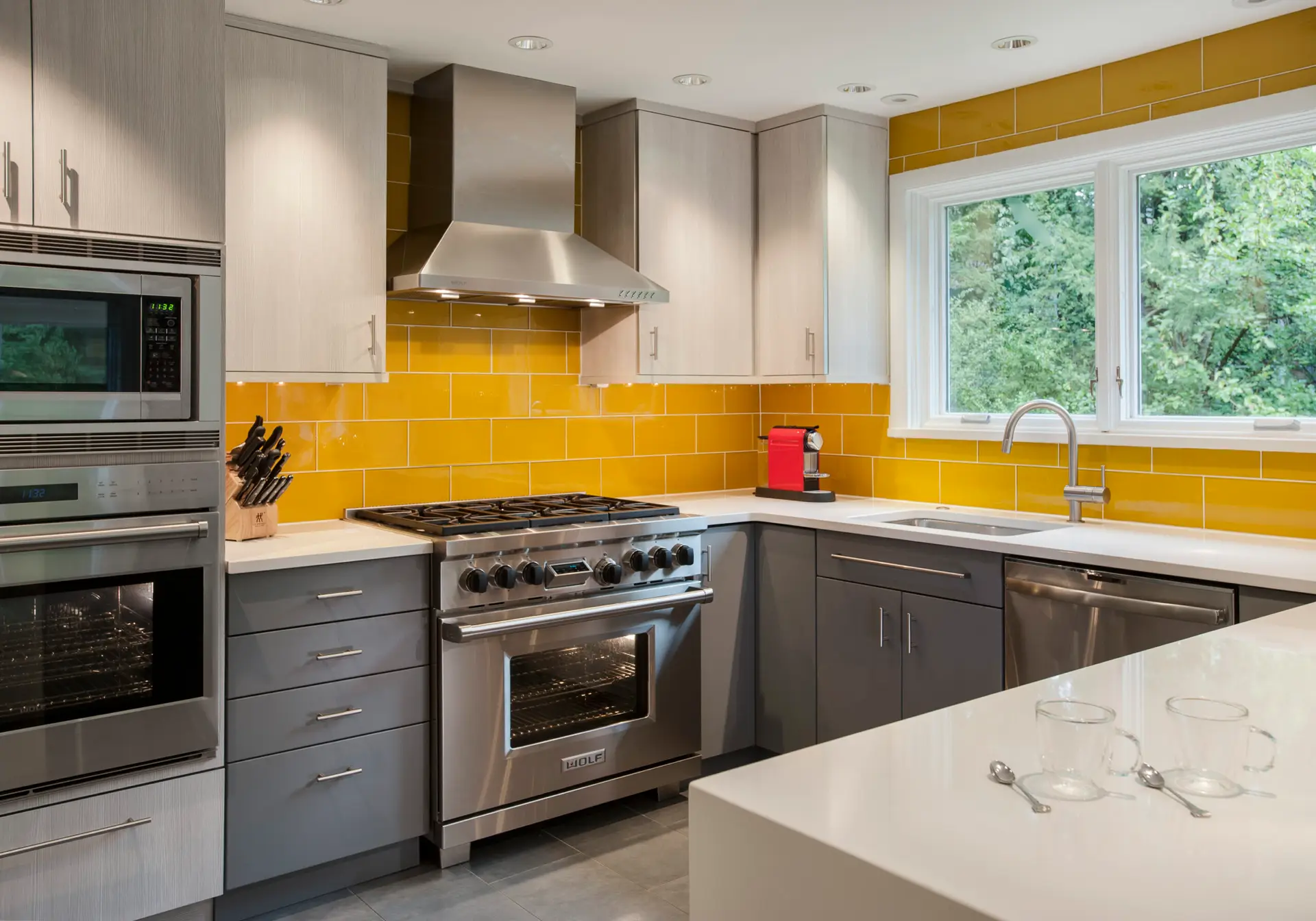

As designers we are often asked to fix people’s paint mistakes. We frequently hear, “I thought __________ (fill in a color) would look good in this room, but when it went up on the walls it just looked awful.” Many times the color family selected is right, but not the specific color. For instance yellow may be a great color for a breakfast room based on size, light, and the direction the room faces. However the client chose the wrong yellow. Choosing the right hue is important but success or failure can come in selecting the correct tint or shade of that color. So what are hues, tints and shade and why do they matter?
Hue in layman’s terms is best described as a color family. We are used to these colors and they are the basic primary and secondary colors we know from the rainbow: red, orange, yellow, green, blue, violet.
Tint is a mixture of a color with white, which increases lightness.
Shade is a mixture of a color with black, which reduces lightness.
There are many more color theory terms but these are the basics. So why do hues, tints and shades matter? Well most times when someone selects the wrong color it is not because they chose the wrong color family (hue) but because they chose the wrong shade or tint of that color (too light or too dark).
Another problem is that we select paint colors from small chips and fan decks (that’s what that spiral paint charts are called) and it is difficult to get a sense of the real color from a small sample. Most paint companies will supply larger samples for free if asked, but still it doesn’t always make it easy to select a color. Also, color changes as you carry it around a room because light changes. Light and shadows make your paint colors look different around the room. Look around the room you are in right now. Do you see how many light and dark areas there are which change the color?
Here are some tips for selecting the right color:
- We suggest you hold up the paint sample to all four walls as it will change with the light and shadows in the room.
- Hold up the whole strip of color so you see lighter (tints) and darker (shades) versions of the color you are considering. You may decide to lighten or darken the color based on how it looks around the room.
- Look at your paint samples with the lights on and with the lights off.
- Look at your paint samples in morning light, midday light and evening light.
- Always look at your samples in the same direction as the surface you are painting. In other words look at wall colors vertically. Look at ceiling colors horizontally and over your head. We often look at paint colors horizontally and on a table where they will actually be in more light, but once you hold that sample up vertically to the wall it suddenly looks darker. Look at the color on the actual surface so the lighting is accurate.
- Buy a two-ounce sample and paint a piece of cardboard that you can carry around the room. Some people paint their samples directly on the wall but the underling color may affect your paint sample and if you paint your sample on a moveable board you can look at it around the room.
When in doubt call an expert. Designers spend their entire lives dealing with color and therefore are color experts who have really developed a very critical eye for discerning subtle differences within colors. You will hear us say very strange things like “that’s a very green blue” or “there is a lot of red in that blue”. It may not make sense to you but what we are doing is seeing the color within the color. That matters because it will affect the success or failure of your color selection.
Next week we will discuss some of our favorite colors.