
Have you ever binged a television show and admired the way the main character’s home is decorated? Or maybe you noticed the color of that one wall or that you have that same coffee maker on the counter! Next time you’re staring at the ever-growing wall of paint color strips tucked into their slots at the store, you can draw inspiration from the very interiors you invite into your own home through your tv screen.
“Friends”
These colors are reminiscent of the iconic décor from the Friends’ set. Monica’s purple walls, the infamous sofa in Central Perk, and the kitschy yellow frame around the front door peephole. And let’s not forget the greige that covered the doors and trim of Joey and Chandler’s apartment! No doubt they would be considered very trendy today. These colors are fun and vibrant, especially if you are going for a more modern look, but deep enough to be just the right blend of playful and tasteful.
“Bridgerton”
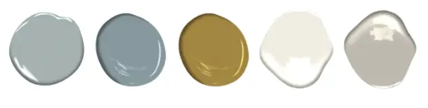
Daphne Bridgerton’s room is adorned in pale blues, yellows, and beautifully mixed patterns from the Victorian era. The lush style of both the interiors and the fashion in Bridgerton is truly inspirational. Bringing these colors into your home, you’d be mixing vintage and contemporary into perfect cohesion.
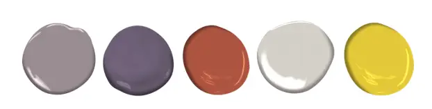
“Stranger Things”
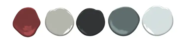
Stranger Things throws us back to the ’80s, which in itself has very lively colors and patterns. With the trends leaning more towards moodier colors in the design, using those elements from the show is a great way to bring some depth to your space. A rich red to add a pop of color while still achieving that moody vibe mixed with a foolproof black, and hues of gray-blues is a sure-fire way to harmoniously give your space that wow factor.
“Great British Baking Show”
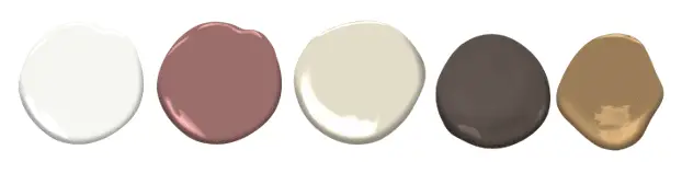
When you think of The Great British Baking show, there are several color palettes that might inspire you. We’ve gone with the neutral and warm tones found in delicious baked goods that will translate as soft and elegant in your home. With the perfect white as your foundation, combining soft creamy hues, a rosy accent, and a darker modern brown freshly sets up the ambiance of a neutral, yet playful color scheme.
There are many ways for you to find the perfect color palette for your home. Not only are there plenty of television shows and movies to be inspired from, but each one can inspire many different palettes! At WPL Interior Design, we know that finding the right color scheme for your home can be overwhelming. There are just so many colors to choose from. But we’re here to help. Start your own Pinterest board or mood board with your favorite color palettes. Then, meet with one of our designers to help narrow down the choices. Additionally, we can help you find the perfect paint matches, as well as the right contractors for your paint job. For final touches, we can even help find the right accessories to match your new paint.
Schedule an appointment with us today to go over your favorite paint options!