It is no secret that “going green” has taken the world by storm. This buzzy phrase has gradually become a core part of our being, changing nearly every aspect of our day-to-day lifestyles, business strategies, architectural design choices, and so much more. While its association with sustainability and environmental reform stands true, the color itself is having an equally as powerful and influential moment. As we all sat at home during quarantine, contemplating our next home renovation, the natural world around us quietly emerged as the answer and inspiration for so many of our design choices; for good reason. Psychologically, ‘green’ has been linked to associations such as tranquility, safety, nature, creation, and motivation; all of which we so desperately needed during those anomalous times.
Green’s Versatility
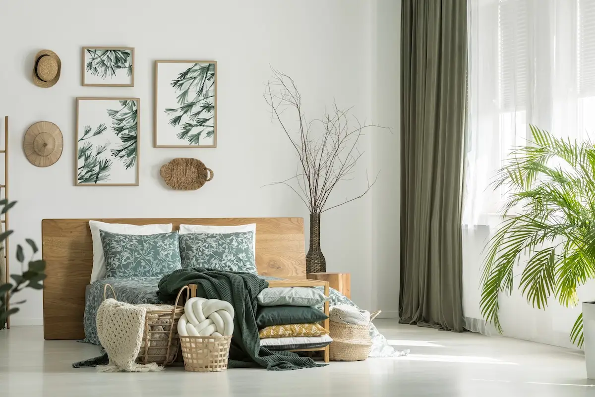
Whether you’re sifting through Benjamin Moore, Valspar, Sherwin Williams, or Farrow and Ball catalogs, one thing stands true, ‘green’ was the clear and unrivaled winner over the past two years. The world of green is expansive and ranges across so many different tones and shades; some lend themselves toward warmer shades with red or yellow overtones, while others veer in the direction of the cooler turquoise hues. Green has shifted from a traditionally industrial or corporate tone to the new neutral for so many homes across America. Green’s versatility is truly unmatched and can satisfy any and all of your design needs. From a calming, muted ‘sage’, to a playful ‘mint’ and of course that classic and moody ‘hunter green’. The color’s central location on the color wheel allows for endless opportunities to mix and match so many different color combinations, such as blues, yellows, browns, and even pinks.
Some Greenspiration
Evergreen Fog, Sherwin Williams
Evergreen Fog was chosen as Sherwin Williams’ Color of the Year for 2022. This subtle yet neutral tone pairs perfectly with natural woods along with other toned-down neutral colors, like creams, beiges, and whites. The hue is not too dark, but not too light; it has the perfect tinge of class without being too playful.
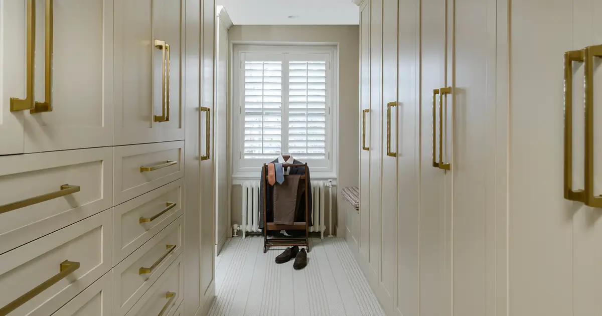
Windsor Green, Benjamin Moore
This deep and dark tone can take any space and immediately turn it into a refined, sophisticated haven. The shade is perfect for small powder rooms, libraries, offices and and even kitchen cabinets and cupboards. Windsor Green pairs perfectly with off-whites, grays, and natural wood tones.
Royal Orchard, Behr
This green is a real mood booster; it’s energetic and fun, yet tranquil. This hue has the ability to invigorate even the smallest of rooms. Although it may feel like a darker shade, when the natural light hits, it really pops. Royal Orchard pairs beautifully with both darks and lights. We even love this shade paired with a black and white checkered floor!
Green Smoke, Farrow & Ball
This dusty, green-blue is bold without being overpowering. This color is so timeless that designers dating back to the 19th-century have been styling rooms with nearly identical shades of green. You simply cannot go wrong with this Farrow & Ball best seller.