Neutrals will never fade. They offer endless versatility and a calm ambiance, evoking timeless elegance and focus in living spaces. The way neutrals can pair with any other color and adapt to personal tastes truly justifies their popularity. Neutral color palettes also provide a timeless appeal and utility as opposed to bright, bold color palettes.
With neutrals, the possibilities are endless. Read on to unlock the secrets of neutral colors and make choices that stand the test of time.
Enduring Versatility of Neutral Colors
Neutral colors are a great choice for adding versatility to a design palette. Their ability to complement diverse textures and styles without overpowering them is unmatched. Neutrals offer a blank canvas that can be transformed with the seasons or the latest trends without requiring a complete makeover. From minimalist to eclectic styles, neutral palettes can support a wide range of interior design looks.
Neutral Tones: The Understated Choice
Overtly bold and attention-grabbing color schemes are not for everyone. Neutral tones are perfect for individuals who value a more refined and subtle elegance. With the ability to withstand the fleeting nature of trends, neutral colors exude a timeless quality, ensuring they remain a staple color palette for households.
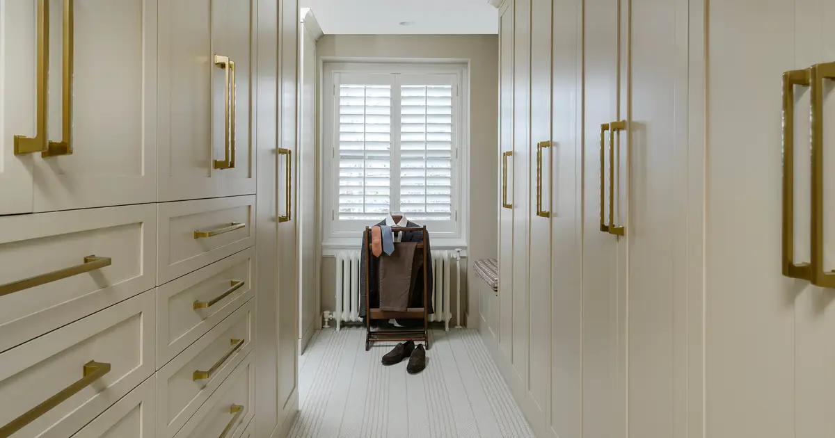
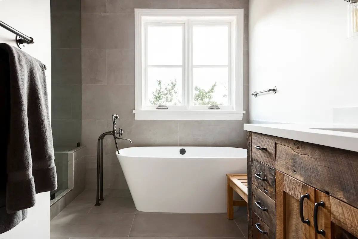
Neutral tones also serve as an excellent backdrop. The versatility of neutral colors is unmatched, allowing them to blend with any aesthetic seamlessly. Their adaptability allows the ability to shift between styles and themes with ease, eliminating the need for frequent redecorations. Whether it’s a bright piece of artwork or a vibrant piece of furniture, these neutral colors act as a supporting base that allows these elements to shine without competing for attention. This harmonious balance is what anchors spaces in a style that never feels outdated or out of place. Neutrals provide a canvas for creativity and evolution within any space of your home.
Neutrals as a Catalyst for Relaxation and Focus
In a fast-paced world, coming back home can promote relaxation when implementing a neutral color palette. The soft tones of beige, ivory, and gray are known for their psychological benefits, significantly reducing visual clutter and providing a soothing atmosphere. These hues have an inherent calming effect, which makes them ideal for environments such as offices and study areas where focus is critical. Neutrals not only create aesthetically pleasing spaces but also serve a functional purpose by encouraging productivity and mental clarity.
The Infinite Potential of Neutrals in Design
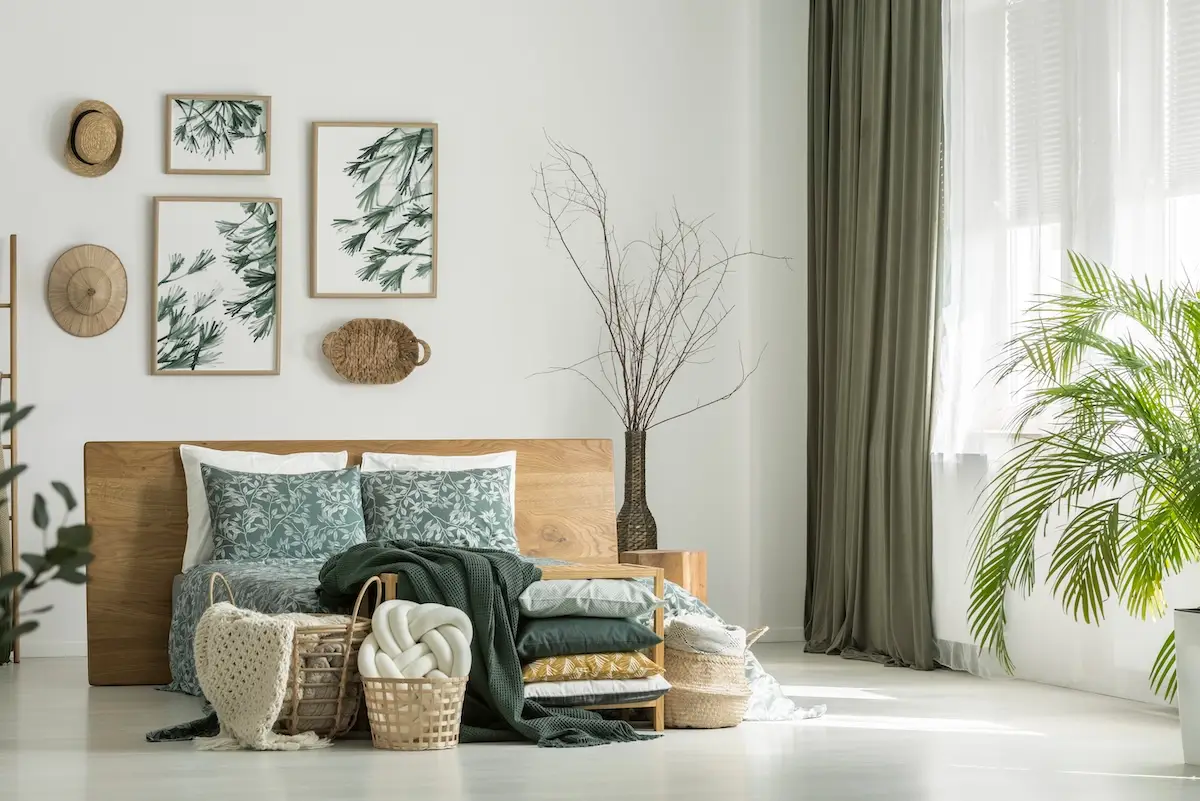
Neutral tones provide a canvas of infinite potential for designers and homeowners alike. The possibilities of design are endless when using a neutral color palette. By starting with a base of neutrals, one can introduce a multitude of textures, patterns, and splashes of accent colors to create depth and interest within a space. Whether it is a bold piece of avant-garde art, a vibrant throw pillow, or a unique vintage rug, these items can shine against a neutral backdrop. Avoiding the need to completely redecorate the home creates a bonus sustainability element as well.
Having explored the various facets of neutral colors, it’s evident that their understated elegance and functionality are the reasons why neutrals will never fade. Contact us to learn how to implement a neutral color palette into your home!